Designing for Students Part 2
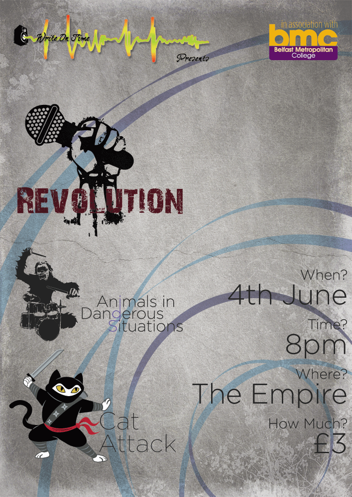
So... to follow on from my previous post on the topic of design work for students.I got some feedback on the designs that I had created. The bands all loved their logos. The poster for Cat Attack received no criticism, whilst the main group poster for all groups received some. Apparently the background was "too nice". I'm not exactly certain how the teacher that came to this conclusion actually came to this conclusion, but I won't argue. They also weren't pleased with the logo placement on the poster... having the Revolution logo so close to the event details pulled the eye away from the details. Looking at the design now, I'm inclined to agree.
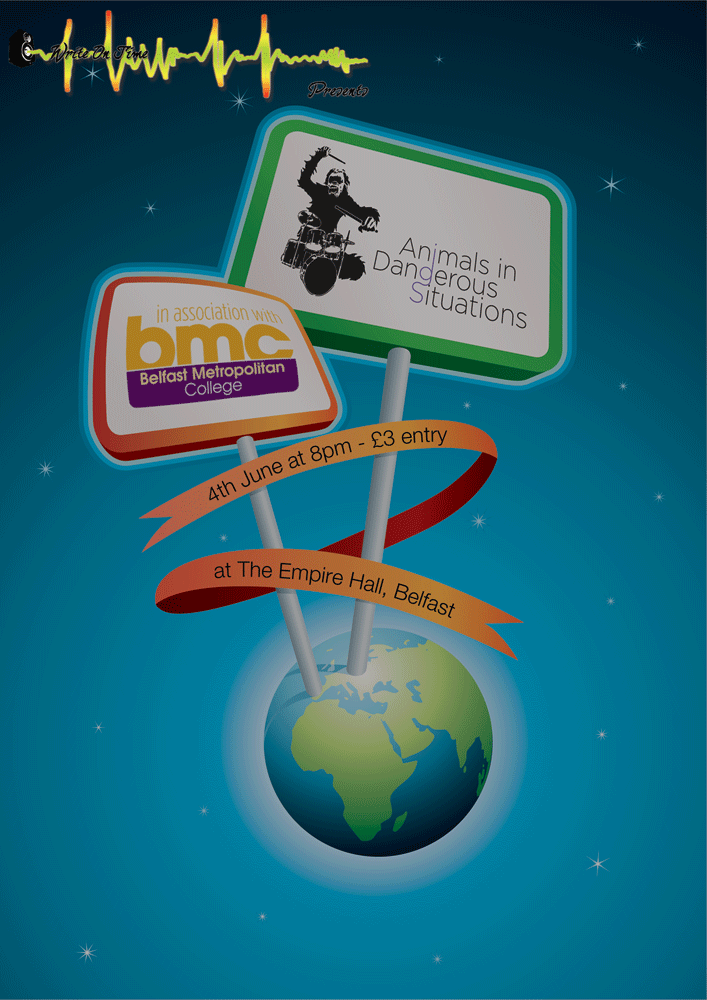
In addition to this, I also received requests from the bands that I hadn't designed posters for, asking if I could produce designs for them too. When I'd designed the logos for these bands, I had already decided that I would enjoy working on a poster for Revolution, though I wasn't too sure about Animals in Dangerous Situations. I didn't see any easy way to come up with a suitable poster for them that would match up to what they wanted. It turned out that I was spot on with this concern and, after two or three hours of looking for suitable material, I had to throw something together. I liked the design, but it's woefully inappropriate for the type of band they are and the type of music that they play.
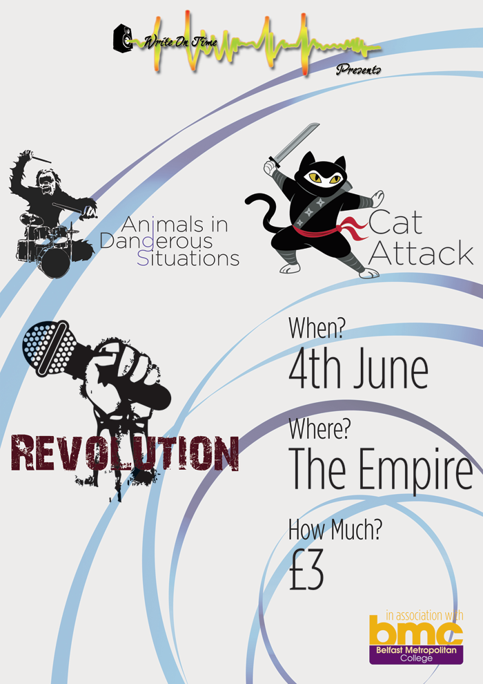
After completing the new band posters I turned my eye back to the original group poster. I shuffled the logos around and filled out the details to have a greater level of detail, based on extra information I had been provided. I liked the background and whilst I didn't think it was "too nice" I will admit it was lacking something... perhaps it was "too clean" and that's what the teacher meant? In the end I went with applying a grungy effect to the background of the poster. It toned down the background from a plain white to a (for me) much more appealing colour, and provided a texture to the whole poster.
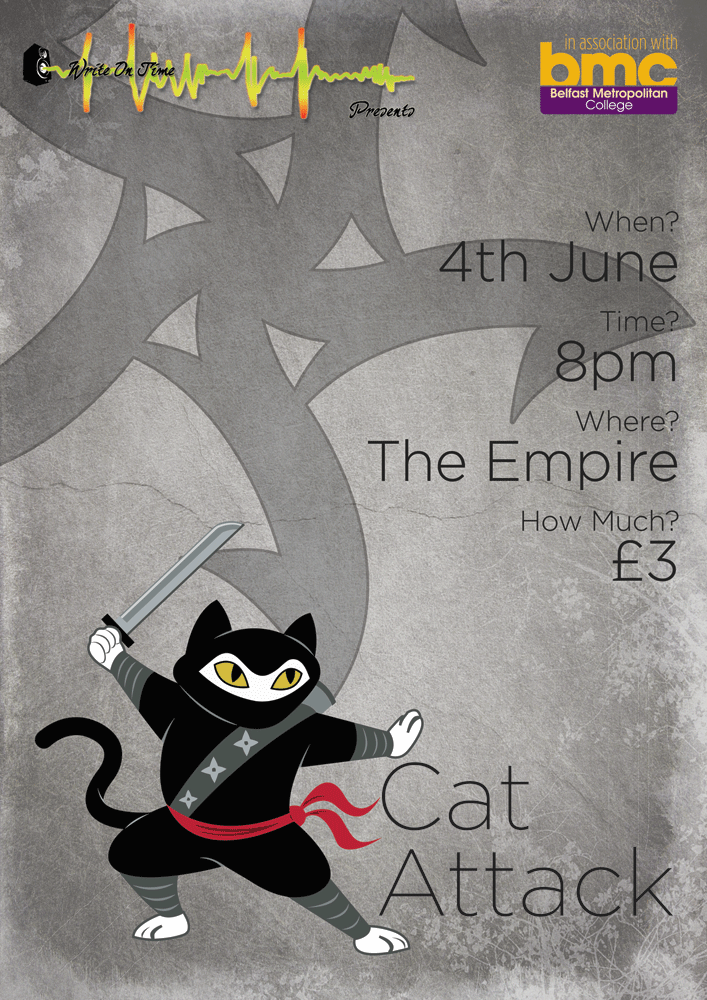
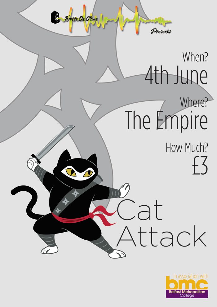
Finally I turned my eye, once again, to the Cat Attack poster. Whilst it had received no criticism when people had first seen it, it was now looking rather plain in comparison to everything else that I had produced. Some details needed updated to reflect the information on the other posters, which was done with ease. Finally, I applied the same grunge effect to this poster that I did to the main group one.
The Pieces that I provided them with today can be seen here:
- Group Poster/Flyer
- Animals in Dangerous Situations Poster/Flyer
- Cat Attack Poster/Flyer
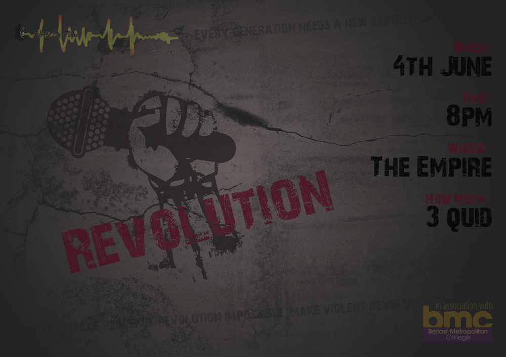
- Revolution Poster/Flyer
Posted by Wulf on May 8, 2009, 1:36 pm with 3 comments - Permalink
Designing for Students
So with me busy as all heck you would think that I would have no time to do graphicy work for other people, wouldn't you? Potentially laughably, this has not been the case. I was approached by Write on Time recently regarding some printed designs for an upcoming event of theirs.
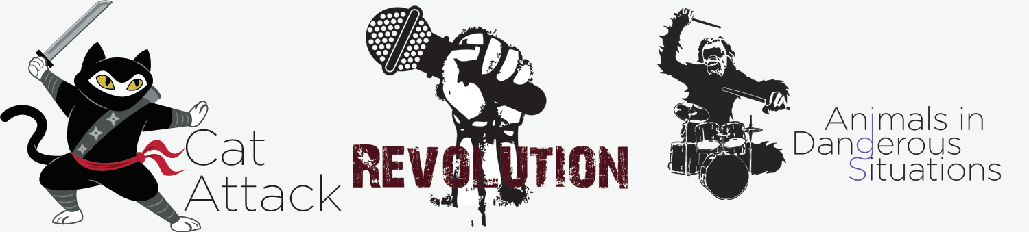
This ended up entailing producing logos for three bands, not all of which had solid (or even vague) ideas as to what they wanted for their logos. I also had to put together rough concepts for flyers for a group event as well as an individual flyer for one of the bands. I have received some feedback on the flyers and will be adjusting them for the end of the week, as well as requests from the remaining bands to produce flyers for the other two bands. The following is how things are currently looking:
It's been fairly hectic producing these around my own busy schedule, but I've enjoyed some of them. I really like how the Revolution logo turned out, can't wait to give their poster a go.
Posted by Wulf on May 6, 2009, 1:07 am with 1 comment - Permalink
Additions to Site Functionality
Today sees the completion of an important section of my site, the Portfolio Page. I had a rough idea of what I'd wanted it to look like for a short while now, and started throwing bits of it onto the site a day or two ago. It's now fully up and running.
I also implemented a new piece of functionality to the site. Visitors can now post comments on my various blog sections. It's still under development, so be warned that things may break or not work properly, but I'm confident enough in it's ability to take a hammering and let people loose on it.
Posted by Wulf on May 3, 2009, 12:49 am with 1 comment - Permalink
Friday May 1st
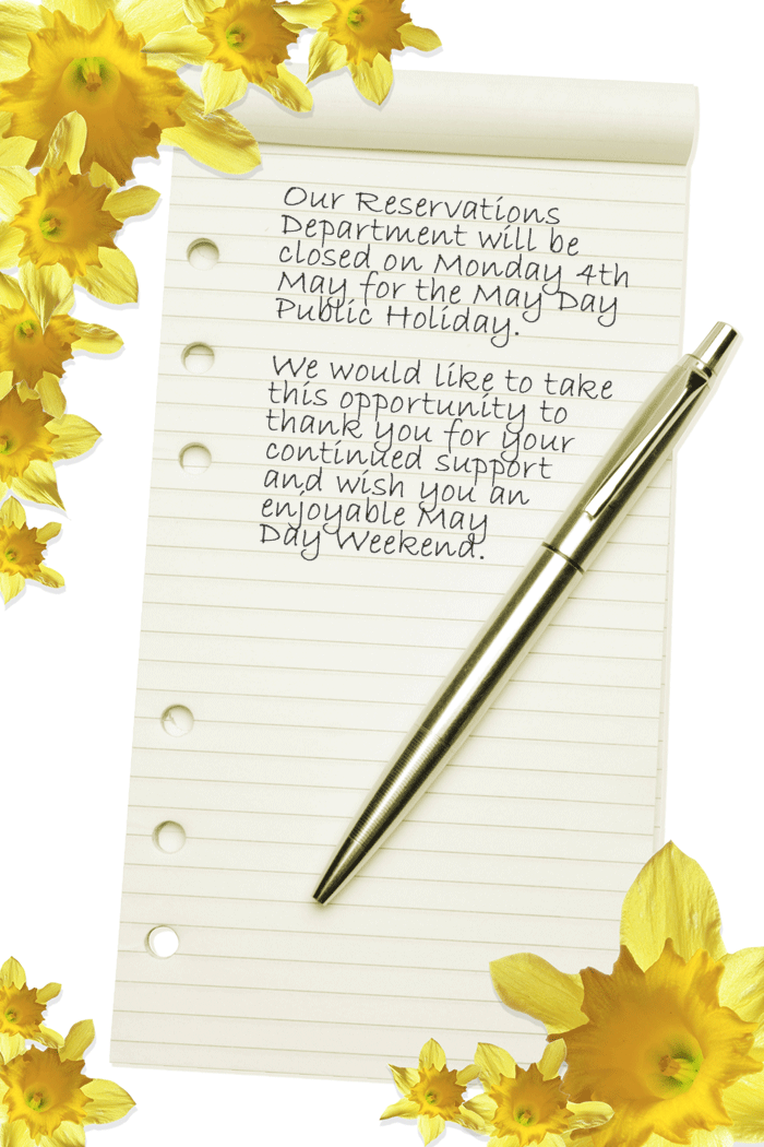
I spent yesterday working on a few minor alterations to flyers I had produced this week, to get them ready for print. Got feedback on the flyer I did for the Continental Airlines Promotion that will be run throughout the month of may. I also put together an eflyer to be sent out to the companies that Thriftway Travel deal with to inform them that we won't be open on May Day. These can be seen here (Continental Airlines Promotion) and here (May Day Eflyer) respectively.
I would have had this posted up yesterday, but I came home to a slew of Computer related problems that I finally got worked through earlier today. Next week won't have much by the way of Placement Blog Posts, as it is coursework crunch time combined with the May Day Public Holiday. Who knows, maybe I'll manage to squeeze something into one of the other sections of the site.
Edit: Just remembered that I also managed to get the Flights and Category sections completed for the Thriftway website, and I have put together concept images for a few extra tweaks that can be made to bring the rest of the page together with this new look.
Posted by Wulf on May 2, 2009, 9:21 pm with 2 comments - Permalink
Wednesday April 29th
Today I finished off the flyers I was working on yesterday, and made a few tweaks to ones that were almost finished. The Continental Flyer looks really nice, at least to me, and I will be able to post up on Friday what the Regional Retail Manager from Continental Airlines thought of it. I'll be looking forward to hear what they had to say about it.
I also had the luxury of helping Will with various PHP woes that he seemed to be having. It's almost ironic that many of the problems are things that I myself have encountered (repeatedly) in various forms. Fingers crossed he learns from them better than I seem to. Or that, at the very least, he keeps a list of handy snippits of code that can be used repeatedly like I've made myself do. Nothing is more frustrating in a piece of code hundreds of lines long than looking for a single ', " or ; that you have left out. It's something of a blessing that you get line numbers in error codes most of the time.
In college again tomorrow so I'll be updating this section on Friday. Hopefully I'll get some more work done to my site tomorrow and maybe post something up in another section of the site.
Posted by Wulf on April 29, 2009, 7:34 pm with 0 comments - Permalink

