Designing for Students Part 2
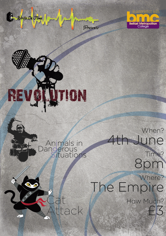
So... to follow on from my previous post on the topic of design work for students.I got some feedback on the designs that I had created. The bands all loved their logos. The poster for Cat Attack received no criticism, whilst the main group poster for all groups received some. Apparently the background was "too nice". I'm not exactly certain how the teacher that came to this conclusion actually came to this conclusion, but I won't argue. They also weren't pleased with the logo placement on the poster... having the Revolution logo so close to the event details pulled the eye away from the details. Looking at the design now, I'm inclined to agree.
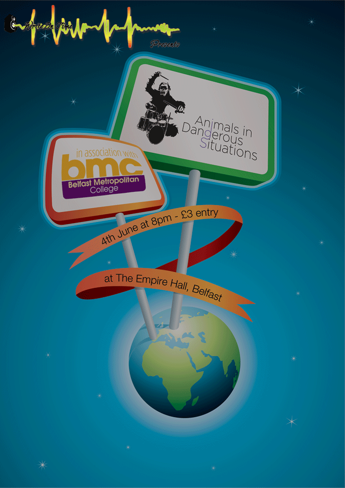
In addition to this, I also received requests from the bands that I hadn't designed posters for, asking if I could produce designs for them too. When I'd designed the logos for these bands, I had already decided that I would enjoy working on a poster for Revolution, though I wasn't too sure about Animals in Dangerous Situations. I didn't see any easy way to come up with a suitable poster for them that would match up to what they wanted. It turned out that I was spot on with this concern and, after two or three hours of looking for suitable material, I had to throw something together. I liked the design, but it's woefully inappropriate for the type of band they are and the type of music that they play.
After completing the new band posters I turned my eye back to the original group poster. I shuffled the logos around and filled out the details to have a greater level of detail, based on extra information I had been provided. I liked the background and whilst I didn't think it was "too nice" I will admit it was lacking something... perhaps it was "too clean" and that's what the teacher meant? In the end I went with applying a grungy effect to the background of the poster. It toned down the background from a plain white to a (for me) much more appealing colour, and provided a texture to the whole poster.
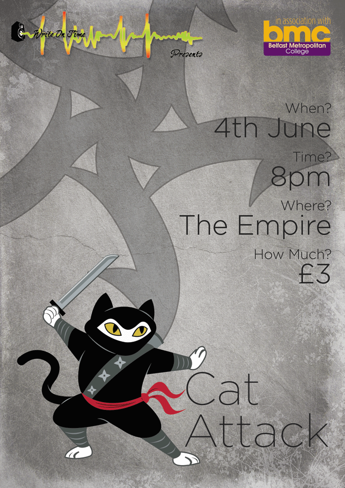
Finally I turned my eye, once again, to the Cat Attack poster. Whilst it had received no criticism when people had first seen it, it was now looking rather plain in comparison to everything else that I had produced. Some details needed updated to reflect the information on the other posters, which was done with ease. Finally, I applied the same grunge effect to this poster that I did to the main group one.
The Pieces that I provided them with today can be seen here:
- Group Poster/Flyer
- Animals in Dangerous Situations Poster/Flyer
- Cat Attack Poster/Flyer
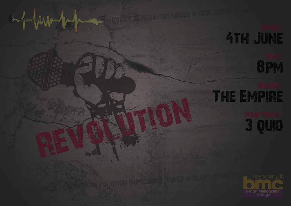
- Revolution Poster/Flyer
Posted by Wulf on May 8, 2009, 1:36 pm


Comments on this Post
posters by Keilantra on May 8, 2009, 1:52 pm
You do awesome work, mister wulf. ^^
Awesome by Raposo on May 8, 2009, 2:50 pm
Good work, specially on the ninja cat (and drawing hands, somethnig I always fail on).
Ninja Pussy attack!!!!!
LOL by Vaia on May 8, 2009, 4:48 pm
You would be interested in the Ninja Pussy, PR ;)
Looks good, honey! Your sleepless night paid off!
Now go get some sleep! <3